
Most business establishments readily accept business reports from Business Intelligence software, that displays them in Funnel chart type which is widely used for sales data presenting. Apart from showing the sales reports, a Funnel Chart represents stages of sales progress or projects potential of sales in the future. If you are looking to create a funnel chart of your own, Office Excel 2016 can help you out with a bit of effort. Excel offers all the tools to create your iconic chart.
 Tags:- Tags
Create & Insert Funnel Chart
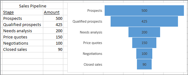
A Funnel Chart is a type of chart that show values across multiple stages in a process that represents a funnel. For example, you could use a funnel chart to show the number of sales prospects at each stage in a sales pipeline. Typically, the values decrease gradually, allowing the bars to resemble a funnel. Let’s see how to insert a funnel chart in Excel 2016 and Excel Mobile.
Insert a Funnel Chart in Excel 2016 and Excel Mobile
As seen in the above picture, set up your data. Use one column for the stages in the process, and one for the values.
Select the data.

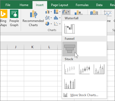
Click Insert > Insert Waterfall or Stock chart > Funnel.
Please note that if you are using Excel Mobile, click Insert > Chart > Funnel.

To insert a funnel chart in Outlook, PowerPoint, and Word 2016, click an empty space in an email message, presentation, or document.
Click Insert > Chart > Funnel.
The funnel chart will appear. And, a small window with example data will appear. Change the numbers to your own.
To add the names of the stages, right-click anywhere in column A, and then click Insert.
Next, Click Entire column, and then click OK.
Type the names of the stages in cells A2, A3, and so on.
At the top of the program window, click the Design tab.
Click Select Data.
The Select Data Source window will appear. In the data, click and drag to select both columns: the stages and the value.
Now, in the Select Data Source window, click OK to close it.
Finally, close the data window.


No comments:
Post a Comment